Features
We figured out the basics so you don’t have to
Ignite simplifies the design process with pre-built components, a Figma UI kit and Drupal documentation. With a customizable Storybook and full documentation, Ignite makes designing more efficient. The basics are already taken care of, leaving more time for creativity.
What's included
Complete starter pack
Ignite sets designers and developers up for successful collaboration. Start with our pre-built components and customize them to fit your needs. We think of it as a jumpstart to your own team’s creativity.

table_rows
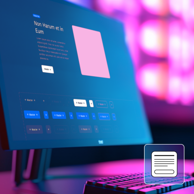
30+ pre-built base site elements
These pieces make up the foundational basics of the site — think buttons, the footer or breadcrumbs.
table_chart
16 pre-built editorial components
These are components site editors can drag and drop to build new pages, such as body copy or a carousel.
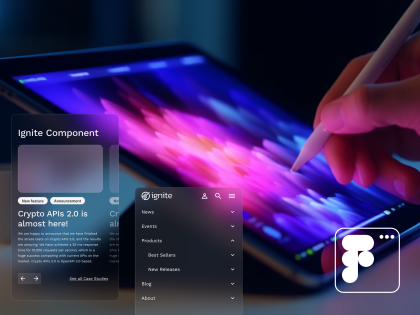
Figma UI kit
Our Figma community file has all the base elements and editorial components for designers to start styling and using to build site pages.
humidity_low
Drupal back-end documentation
This documentation provides guidance for developers to create and maintain an Ignite-powered website on Drupal.
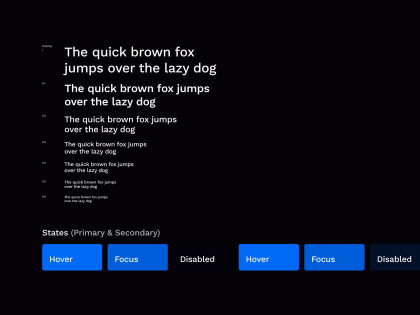
Customizable Storybook instance
With our existing Storybook setup, developers are able to re-style and test UI components for use on your site.
text_snippet
Documentation for designers and developers
We’ve created documentation to make all parts of Ignite easy and straightforward to get started with.


